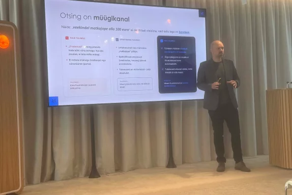
Vitaly Friedman, a renowned User Experience specialist, spoke at kaubandus.ee UX conference on the 10’th May. He is one of the few speakers to have been invited back to the stage at the conference, and appeared twice on the same day – as the first and last speaker. Vitaly has spent the last 20 years creating great user experiences, training, running the UX blog Smashing Magazine and working with world-class brands such as Zalando. In our opinion a presentation with good content and we will give you what we think are the most important points/key takeaways from the 280 slides and 2 hours of presentation.
At the end of this blog post, we’ll also give three suggestions from Lumav’s experience on how the technical and design teams could work together.
P.S. At the same conference, our good customer Loverte won the title of the most user-friendly e-store in the category of beauty products with its new Magento PWA platform. Congratulations!
Most important – Trust
As many as 69.99% of shopping carts are abandoned, and Vitaly cited various studies from 2011-2023, all of which ranked unpredictable extra costs as the number one reason for abandoning a purchase, followed by being forced to create an account. The shopping cart is a comparison tool for users, showing the actual cost.
E-stores tend not to be trusted – people are reluctant to leave their details (including credit card), do not trust price lists or good wishes. It’s the same feeling as a European in a US shop who thinks he’s getting a good deal, only to find at the checkout that there are taxes on top of the price. What information/supporting material to display to build trust is a key question for the e-tailer.
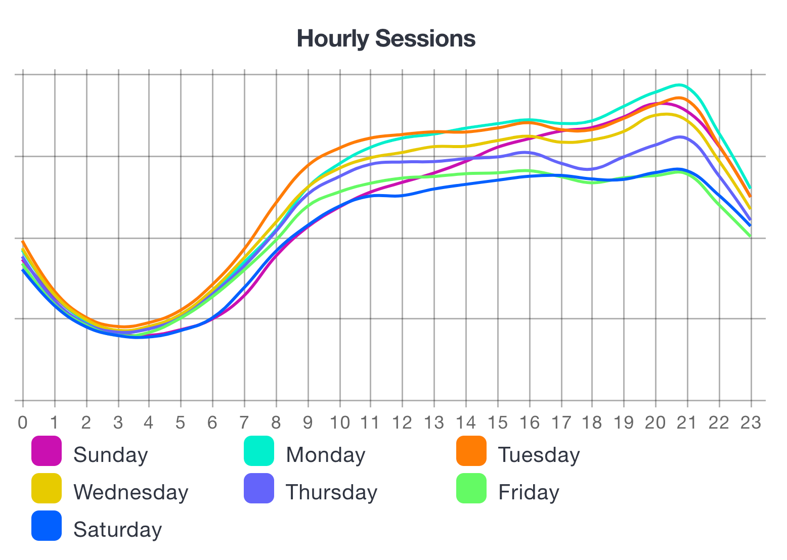
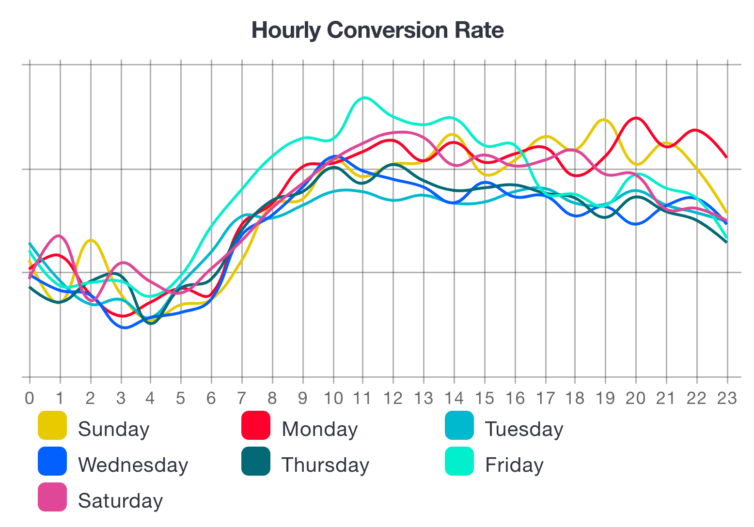
Timing the purchase decision
Knowing when people will buy is important when planning a flash sale. Statistics show that footfall increases between 8pm and 9pm, but conversions increase between noon and 9pm (excluding Fridays). Below are some graphs (source: Workarea, “Trends: When Do People Shop Online?”).
The speaker also pointed out which goods people buy impulsively and in which buying process the purchase decision is more analysed.
- Impulse: beer, books, dryer, car insurance, food, batteries, weekend hotel, CD, small electronics, socks, dishwasher, digital products, toys.
- Longer decision: holiday trip, washing machine, wine, bicycle, shoes, antiques, TV, handicrafts, fridge, flowers, watch, house, home loan and Apple products (Anything by Apple).
While an impulse purchase is made with an average of 1 visit, and Mobile is valued for quality and service; a longer purchase is made with 2.1 visits across channels, and price and speed are valued. Vitaly also shared more detailed tips, such as how to build a page, but we will not stretch the blog post too long. Importantly, for an impulse purchase, the brand is researched and for a non-impulse purchase, the product reviews are researched.
More important ideas to improve User Experience
Below some more specific advice from Vitaly:
- To test the UX, Vitaly suggested a banana test. Replace the texts of the buttons with the word “banana” and let the customer guess what should happen when he clicks on the button, based on the icon and the design.
- Display ratings – always show the number of ratings and the maximum score (e.g. 4.1 out of 5), ideally as a graph of the number of 1-5 scores. Highlight the ratings that can be considered most useful to customers (both good and bad).
- When ticking the mandatory and non-mandatory data fields, Vitaly suggested:
a) indicate both, to make it easier for the client. Mandatory with an asterisk and non-mandatory in brackets (Optional).
b) indicate exceptional fields – for example, if the majority are mandatory, highlight the optional ones and vice versa. - When typing in a form, many customers tend to have autocomplete blindness, which means that they focus on what is being typed and don’t notice what appears inside the box. They can be assisted by a note under the form (for example, start typing to find your country quickly) or by adding an arrow to indicate that you can also display variants.
- It takes an average of 10 seconds to resolve a Captcha and 20% of those who have to complete it give up.
- Problems with rollover when opening multi-level menus horizontally. If you’ve opened the main menu and start to select a second or third level, accidentally moving over an item cancels the selection and you have to start again. It is necessary to test this on the page. One possibility would be to display a transparent triangle when scrolling the menu, where one point is attached to the selected top menu, the other to the next level, and scrolling over does not activate it. (email info@lumav.com and we will explain further 🙂)
- When activating filters, it is recommended to let the filters be selected first and then confirm. If you start filtering products immediately after selection, it will take a long time and give a poor experience.
- It is recommended that the Call To Action buttons below each other are vertically aligned to one side, so that the user does not have to move the mouse from one end of the screen to the other. The user can also be slightly influenced by the position and colour of the buttons – what you want the user to do – put to the left; what you don’t want them to do – put to the right or down and in a more subdued colour or no button at all.
- Many users don’t trust the back button on their browser for fear of deleting information. Put a separate back button on the form inside the page.
- Infinite scroll issue – when scrolling, there is no way to reach the footer. One solution: sticky footer. A good example: on Pepper.pl you can send a link to infinite scroll, which will open in the right place.
- Asking for email – to avoid collecting trash emails, put a signup form on the product page. Then the customer who has actually checked out the product will be added to the email.
- When the “search” box is immediately open, conversions increase by 32%. Some off-the-shelf solutions open it with a hover or even a click – a recommendation to change this 🙂
We hope that some of the advice was useful and that those still in the design phase of building the page will get some more ideas. If the presenter appealed to you, visit Vitaly’s website and he has put together a separate UX checklist to go over your page design. We were very pleased with his presentation and believe he will definitely be invited back to Estonia.
Balance between Development and UX investment?
Finally, three grains of Lumav’s 10+ years of experience in e-commerce development from a technical partners perspective.
“A good engineer is a constructor“
Before you start designing, it would be a good idea to review both the standard and the existing ready-made solutions, for example from Magento Marketplace or other module stores. Maybe you can take some of them as a basis, make some compromises and get a more cost effective solution. Therefore, we recommend you to make a decision on the Platform before choosing a design partner.
“Moss will not grow on a rolling stone”
Improving the usability of the site is an ongoing process. What is analysed and figured out in the design phase is a best guess and the truth will be revealed when the site is Live. Lumav’s advice is to start by analysing the level of competitors in the market and if the market allows, then create a more standard-like e-shop first. Take input from Hotjar, Google Analytics and customer feedback for further development.
“By the time Johnny got to the development team with design ideas, the budget had already been spent.”
Being part of creating something new is very exciting and, like with education, everyone has an opinion on design. Some best practices are already validated by the market and analysing them does not provide the desired leap in quality. We recommend going deeper into the business-critical parts of the e-store.
At Lumavis, we are ready to help you think about how to get your e-business up and running or develop it further. We are happy to work with UX partners. Get in touch with us and let’s talk more.